Making brand standards practical enough to use
Brand standards work best when they keep things consistent without making everyday tasks harder. A strong brand system should make it easy for people to make good choices quickly, whether they're designing a campaign, building a presentation, preparing event materials, publishing a web page, or creating internal communications.
Whether it's brand, web, print, campaign, or day-to-day work, I've noticed the same thing: guidelines only work when they're easy to use. The best standards turn visual identity into practical choices that teams can actually use within real deadlines.
Brand consistency
Focus
Practical standards
Method
Easier execution
Outcome
The Challenge
A brand can have a beautiful identity and still feel inconsistent if the standards are too vague, too rigid, or too disconnected from how work is produced. Teams need direction, but they also need enough flexibility to solve real communication problems.
The challenge is finding the balance between consistency and practicality. Brand standards need to create recognizable patterns, support accessibility and readability, and give non-design stakeholders enough clarity to participate without diluting the brand.
- Keep visual identity consistent across web, print, social, events, and internal communications.
- Create rules that support real production needs instead of idealized use cases.
- Make brand guidance clear enough for designers, marketers, leaders, and partners to understand.
- Protect quality while leaving room for channel-specific requirements.
- Apply best practice guidelines for hierarchy, accessibility, spacing, contrast, typography, and readability.
What Practical Standards Include
Useful brand standards move beyond a logo page and a color palette. They explain how the brand should behave in common situations and show people what good execution looks like.
That means documenting the decisions people actually face: how to use type at different sizes, how much space a layout needs, what makes imagery feel on-brand, how calls to action should appear, and where brand expression can flex without becoming inconsistent.
- Logo usage guidance should focus on basic standards, not a long list of what not to do.
- Minimum sizes.
- Preferred logo variations.
- How it works with other logos.
- Basic spacing, sizing, contrast, and placement standards.
- Color direction should define the core palette and show how colors work in practical combinations.
- Accessible color options.
- Overall color scheme and preferred color combos.
- Preferred text colors.
- Multi-brand considerations.
- Typography guidance should make type choices clear across both expressive and functional brand moments.
- Accessibility considerations for readability, sizing, contrast, and line length.
- Type scale for headings, body copy, captions, forms, and dense information.
- Preferred type pairings, weights, and hierarchy rules.
- Layout principles should help teams build clear, repeatable materials without redesigning every piece from scratch.
- Grid systems for alignment, structure, and responsive layouts.
- Breathing room through spacing, white space, and content hierarchy.
- Patterns that combine imagery and typography consistently.
- Imagery and icon direction that helps the brand feel cohesive across channels.
- Examples that show approved use, common mistakes, and practical exceptions.
How I Approach Consistency
I approach brand consistency as a system of repeatable decisions, not a set of decorative restrictions. The goal is to make the right choice feel obvious, especially when projects are moving quickly.
A practical brand system gives teams reusable patterns and enough context to understand why those patterns matter. It also respects the difference between a polished brand moment and a workhorse asset that needs to be produced, edited, localized, or handed off.
- Audit existing materials to find patterns, gaps, and recurring inconsistencies.
- Identify which rules must stay firm and which areas can flex by audience or channel.
- Create templates and examples that reduce repeated decision-making.
- Clarify handoff details so files, assets, and usage notes are easy to find.
- Review standards over time as new needs, formats, and workflows appear.
Best Practice, Real Use
Best practice guidelines matter because they protect clarity, accessibility, and trust. They help prevent common issues like low contrast, crowded layouts, inconsistent type scales, unclear calls to action, or branded pieces that look polished but fail in real use.
At the same time, standards should not become so rigid that teams avoid them. When guidance is practical, people are more likely to follow it. That is where brand consistency becomes operational: the standards support better decisions without slowing down the work.
Results
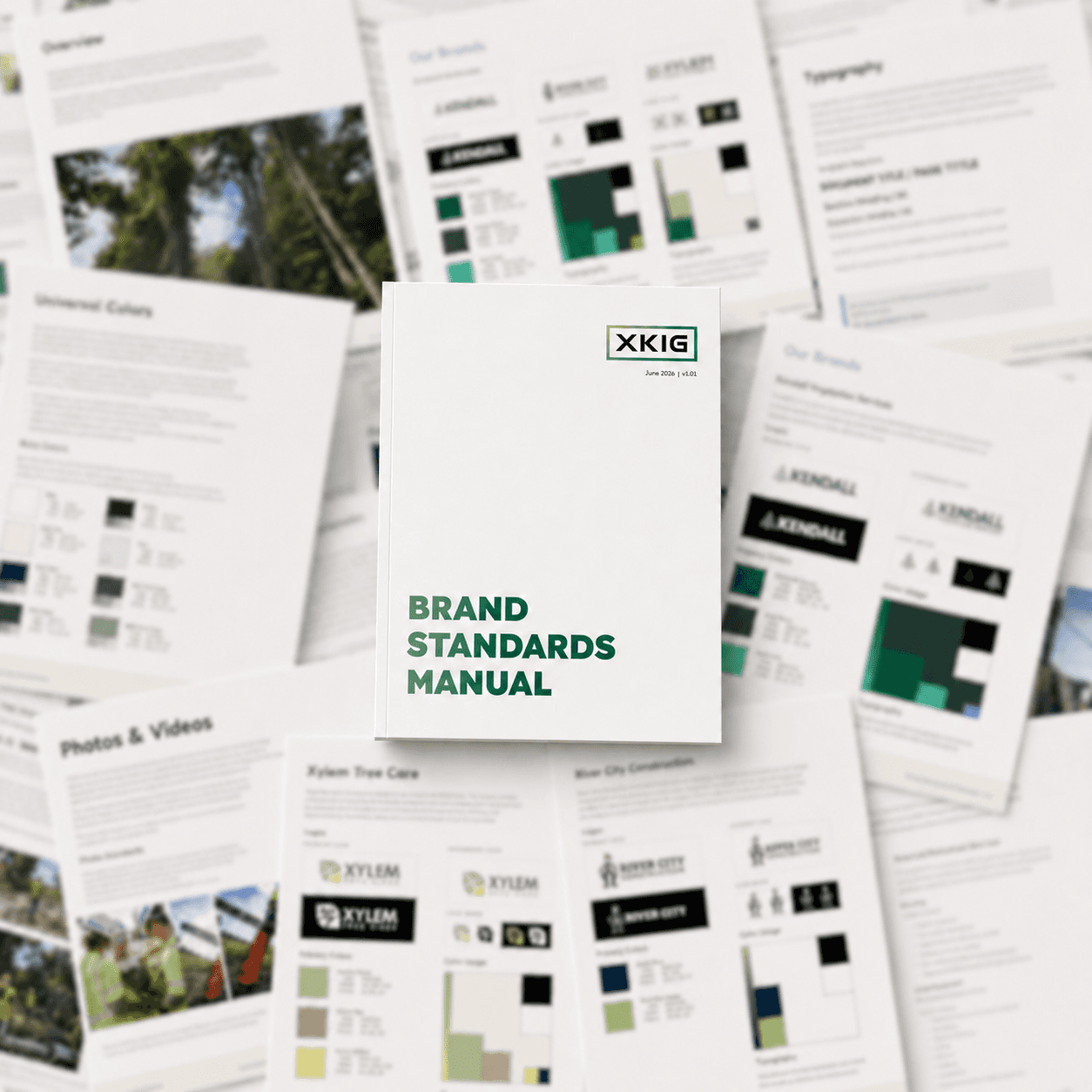
I used the items outlined in this case study to help create a brand standards manual that brought 6+ brands into one unified system. The work started with materials that had already been created by a branding agency, along with past logo files, source documents, and brand references from different points in the company's history.
My role was to organize those existing pieces, identify what needed to stay consistent, and turn scattered guidance into a clearer standards system. The final manual made the brand rules easier to follow while giving teams practical direction for logo use, color, typography, layout, imagery, and examples across multiple related brands.
- Unified standards for 6+ related brands.
- Organized agency-created materials, past logo files, source documents, and brand references into one system.
- Created clearer expectations for designers, marketers, stakeholders, and vendors.
- Made brand guidance easier to follow across logo use, color, typography, layout, imagery, and examples.
- Built a practical standards manual that supported consistency without losing each brand's context.